Opinions & Insights
Design Series: Typography
Picking a good user interface typeface is not a task a designer takes lightly.
Imagine the product as if it is a person, the font is the example of what they wearing. Sure someone’s outfit is not a direct representation of someone’s true self, but most of the times it’s a good indicator of their personality, more formal or casual, familiar, irreverent, you get the point.
Also, for an app, you can't really compromise legibility, versatility, in favor of personality and style. It has to work great at small sizes, large sizes, retina, non-retina, upper and lowercase, etc …
And since we live on the web load times and file sizes have to be prioritized.
Enter Native System Fonts
Recently we have seen great efforts from companies trying to craft and improve their Operative System’s fonts: Google with Roboto, on their second version now, Apple has San Francisco, even Mozilla had Erik Spiekermann design their own system font — Fira Sans.
We have also seen companies making the switch from custom to system fonts on their apps, companies like Medium, Booking, and GitHub.
System fonts come with a few advantages:
- We don't have to host them ourselves;
- We don't have to keep the font files up to date;
- There's no need for the user/client to download, and load them;
But…
Each OS has their own, so that means that it could be a bit unpredictable. It requires you to design with all fonts in mind and testing a lot.
Implementation
--fontFamily: -apple-system, BlinkMacSystemFont, "Segoe UI", Roboto, Helvetica, Arial, sans-serif, "Apple Color Emoji", "Segoe UI Emoji", "Segoe UI Symbol";
--fontMono: "SFMono-Regular", Menlo, Consolas, "Liberation Mono", Courier, monospace;
That’s it.
San Francisco
macOS accounts for the majority of users using Netlify, so if we’re going with system fonts, we should prioritize San Francisco.
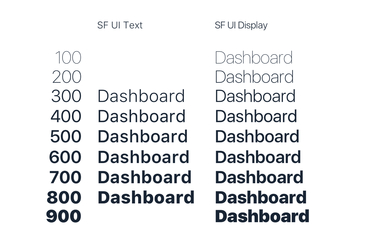
San Francisco UI is a font family composed of two different fonts: SF UI Display and SF UI Text.
- SF UI Display is designed for larger type, such as headers, and it doesn't scale well to smaller sizes.
- SF UI Text is designed for smaller sizes, and it's probably the font that you are reading this right now if you're on a Mac or iOS device.
The cool thing about this is the macOS is smart enough to automatically switch between the two fonts depending on the size of the text. For text larger than 20pt(≈ 26px) the OS will switch automatically from SF UI Text, to SF UI Display.
There's also a slight variance in available weights of the two fonts, for example, you can't add a 8px text in Thin weight.
Prioritizing doesn't mean we will neglect the others, it just means that anywhere I will need to pick just one font, I’ll pick SF, like for a design mockup.
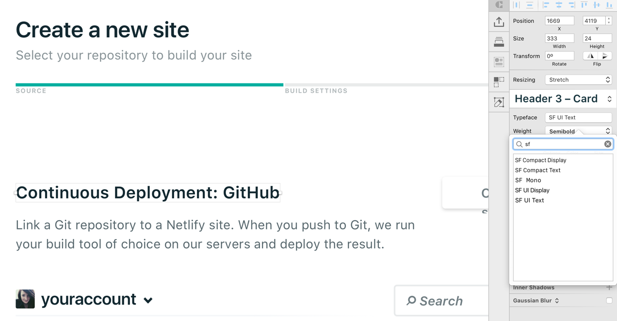
If you want to use San Francisco in Sketch:
- Download the font files directly from Apple;
- Download and install this handy plugin to automatically fix the character spacing to match Apple’s (if you use Text Styles you’ll only have to run it once per style).
- Use SF UI Display for text size > 26, SF UI Text for the rest (again, if you use Text Styles you’ll only have to keep this in mind when creating them).
Source Sans Pro, by Adobe Link
A widely used font nowadays, so we would risk being a bit boring, but it's a solid font.

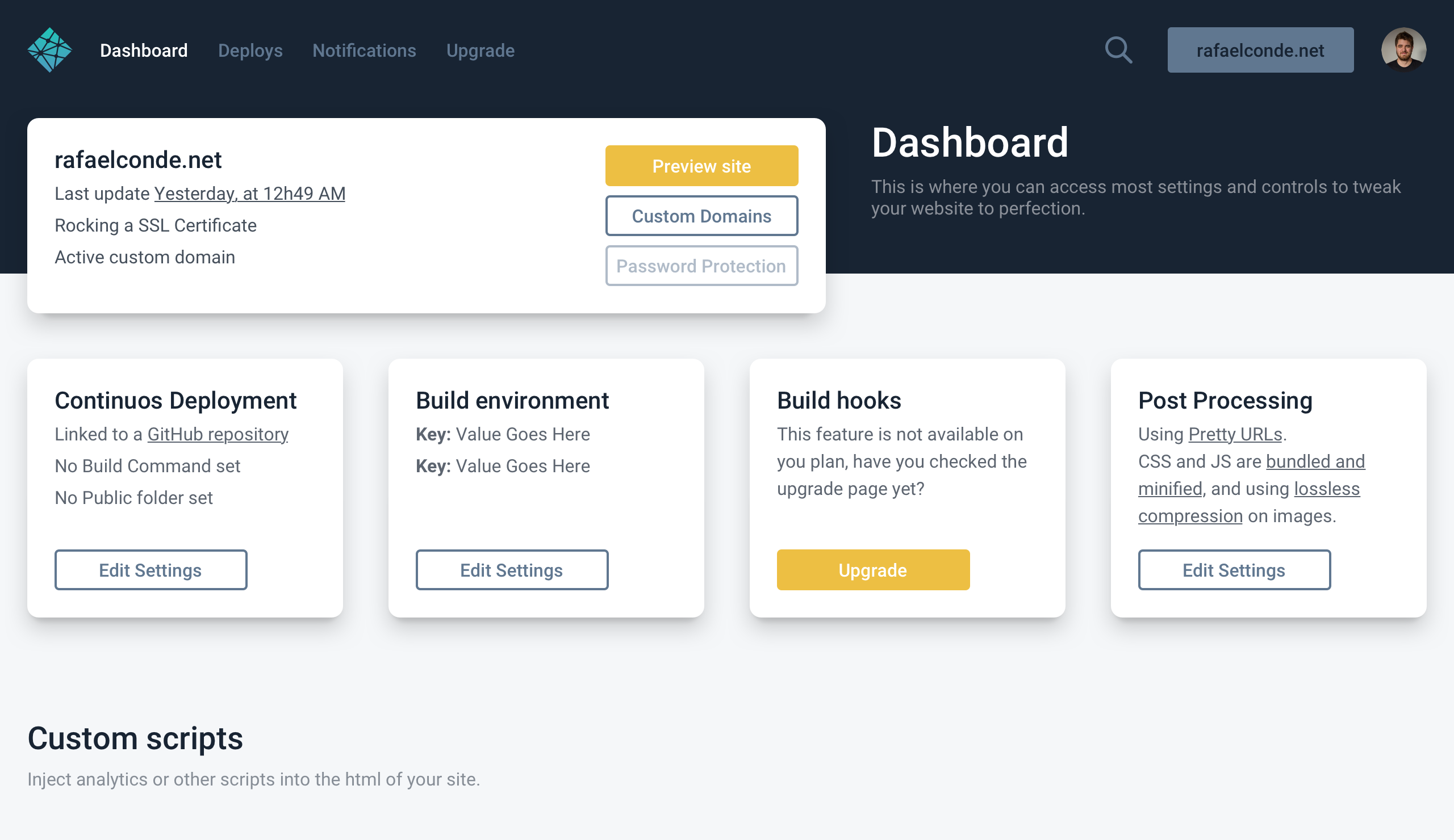
Roboto, by Google
Oh Roboto, Google's font. Since Google updated it last year it really matured into a solid and great font for UI. Being used nowadays for all Google things. It's also as you may know, the font that we're currently using in our marketing site.
San Francisco, by Apple Link
macOS, iOS and all things Apple nowadays. A solid font designed for screens that performs like a champ.
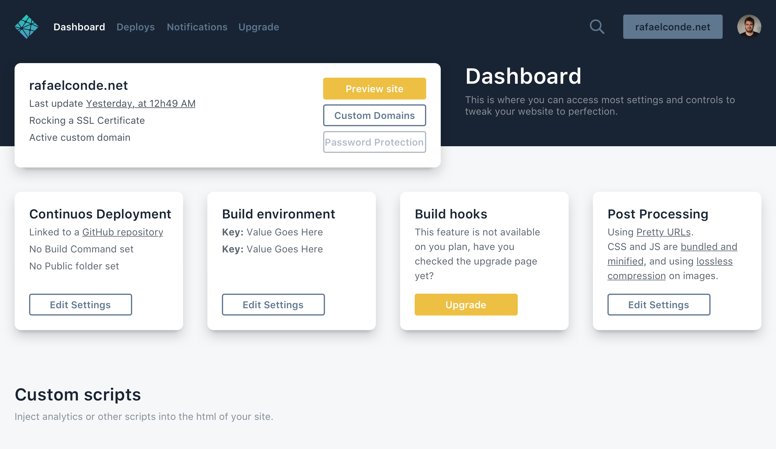
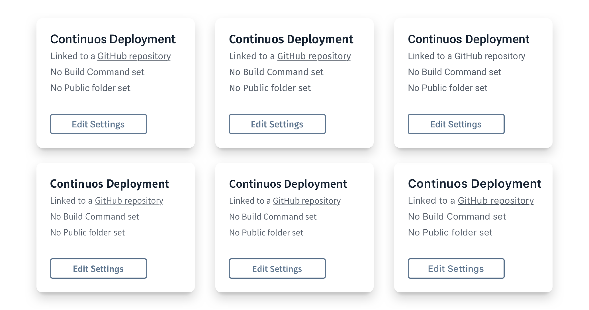
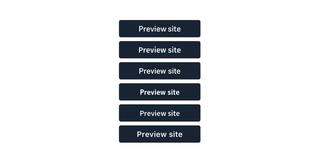
And lastly here's just a couple of side by side examples:
